Misfit 2014 - Graphic Design
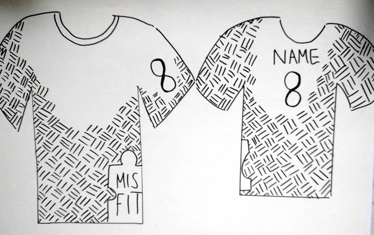
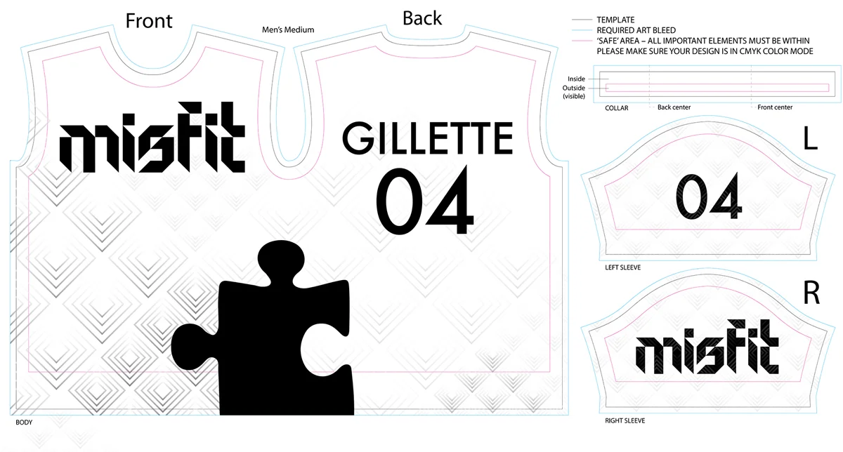
In 2014, I was asked by a member of Misfit to help bring a jersey idea to life. The hand sketched concept was sent to me, which I then brought into Illustrator.
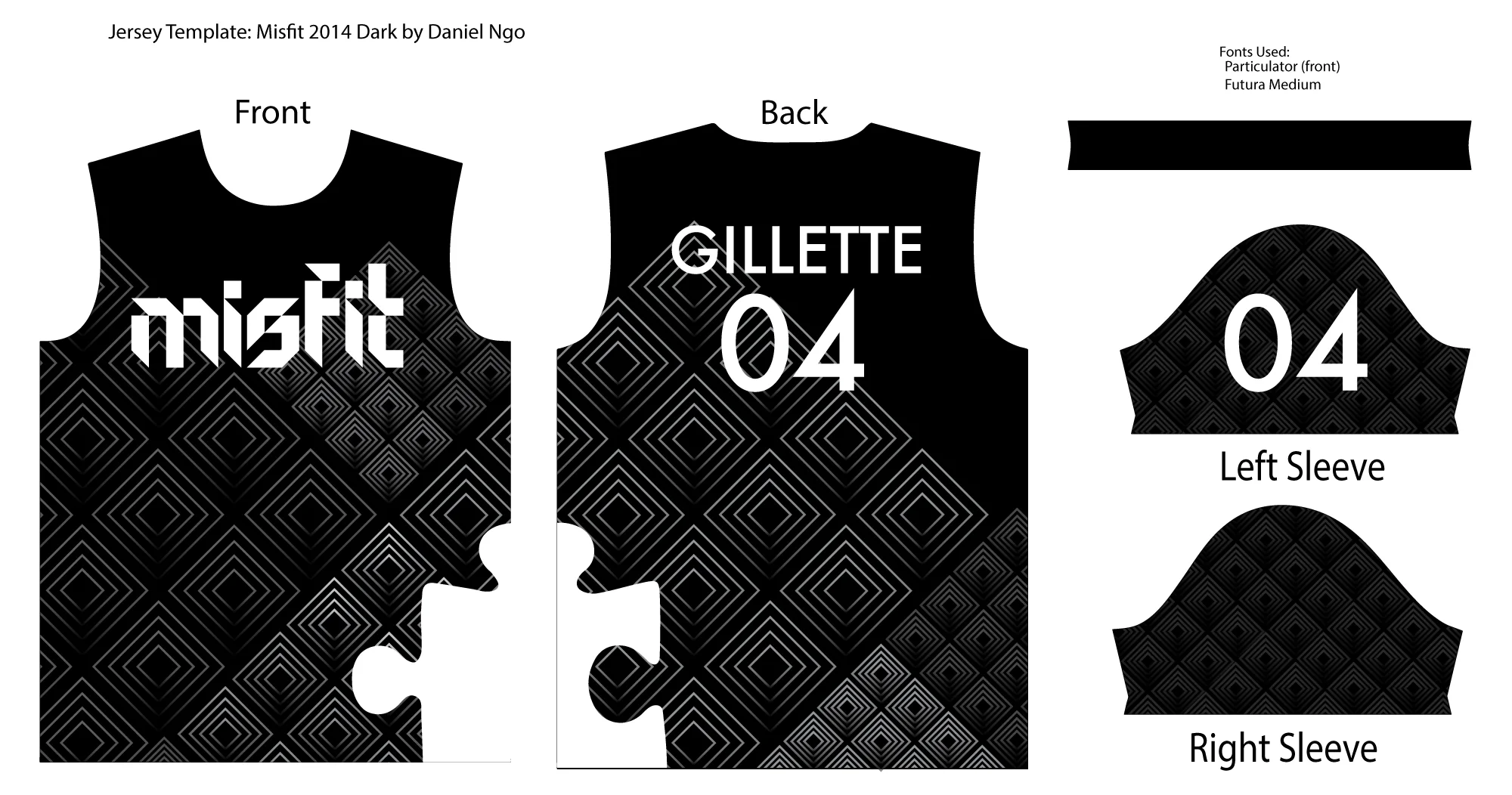
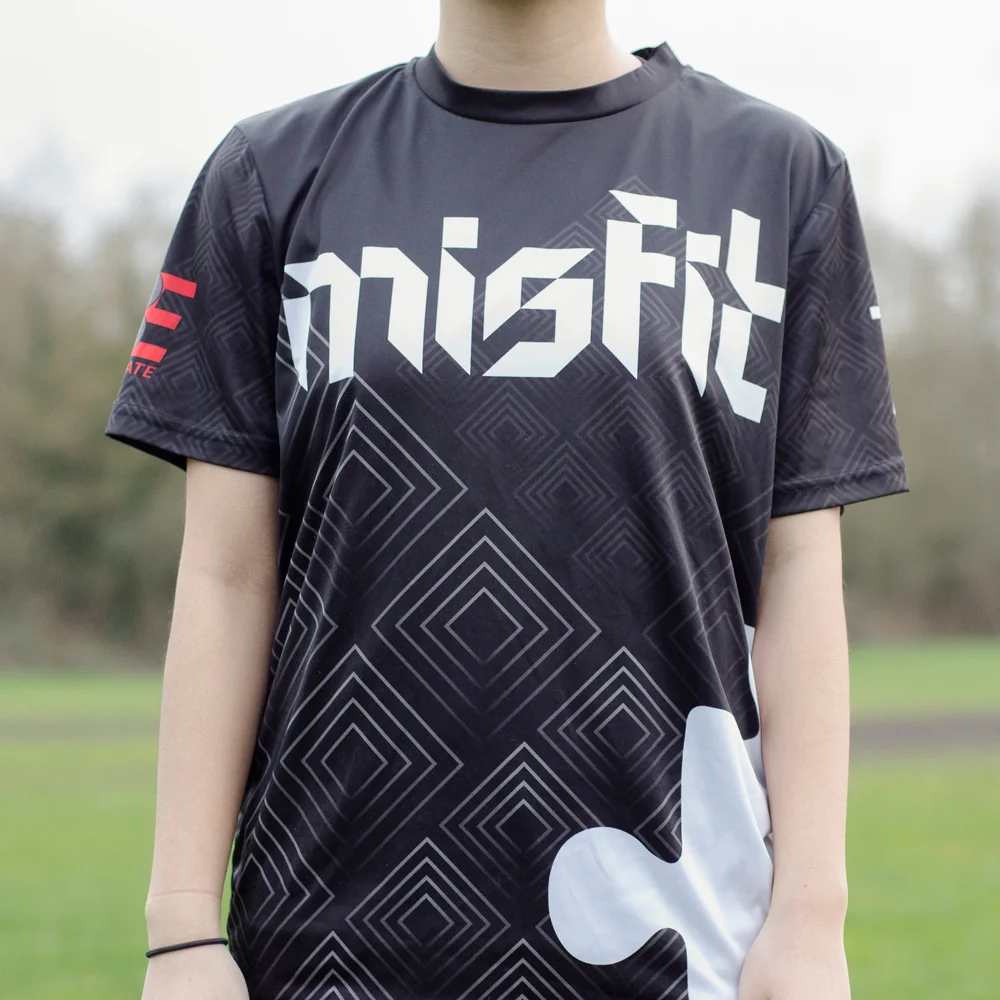
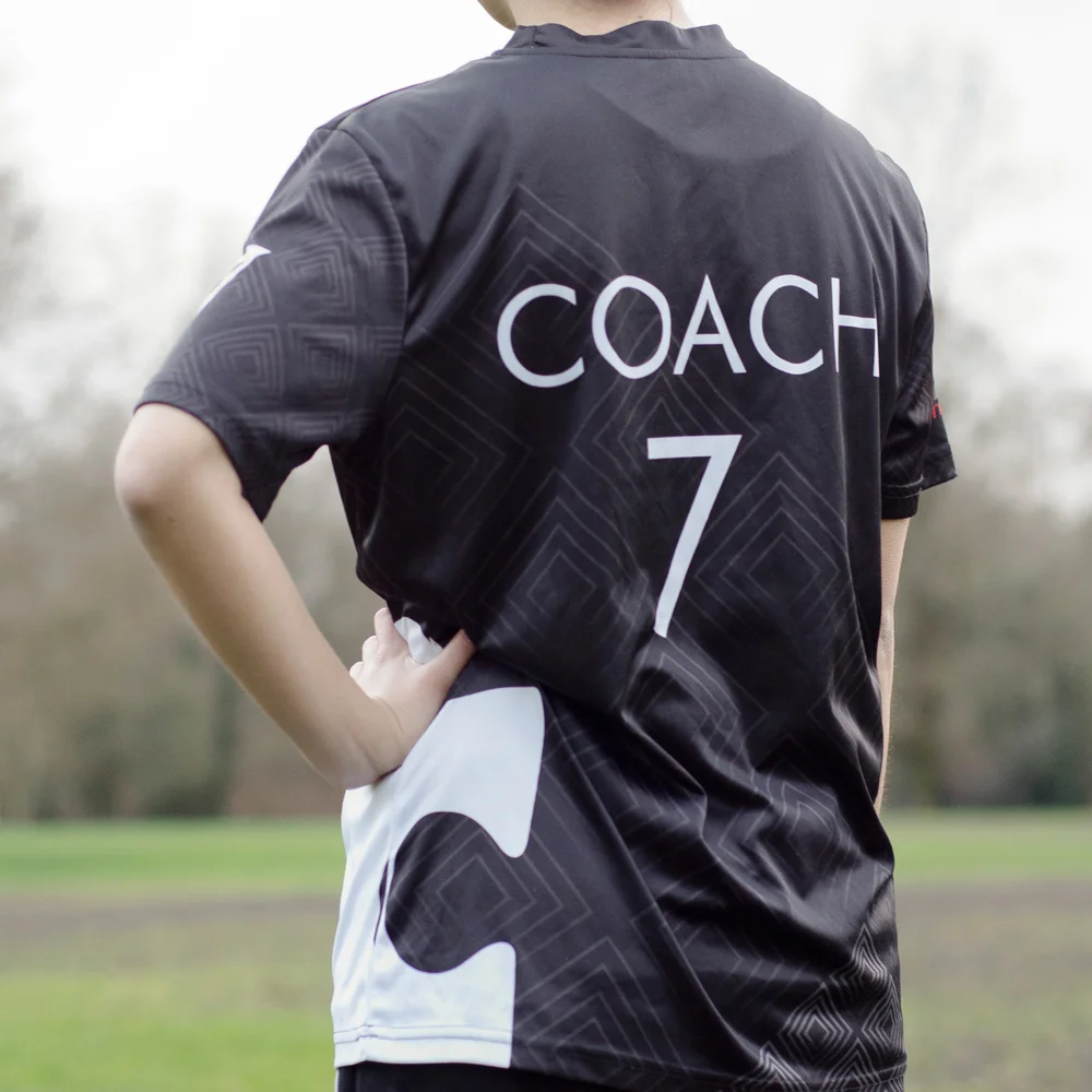
The main goal was to create contrast between the puzzle piece (Misfit's heritage icon) and the rest of the design elements. This was accomplished by using an angular font for the team name (Particulator font by NAL), as well as adding gradients to the square patterns to oppose the flat puzzle piece. I also used Futura for the other text because of it's angular features. It's one of my favourite, timeless fonts.
The team title was moved from the hip area to the chest to have it more prominently displayed. Since a lot of the teams at the tournament are encountering each other for the first time, it's good to instantly be able to tell which team you're on.
I also made a white alternate version, because in Ultimate (and many other sports) teams are required to have different jerseys to ensure everyone can tell the two teams apart. I think ultimately(!) the kids on the team voted to have two different designs for their jerseys, having my design for the dark, and a cool samurai motif light jersey by another designer.
Misfit Ultimate is a youth ultimate frisbee team, run annually in the summer with the goal of competing in the Canadian Ultimate Championships.