Uprise 2016 - Graphic Design


This design was my winning submission for the Misfit Organization's 2016 jersey design contest.
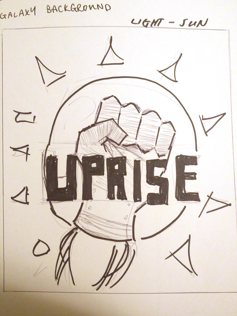
The goal of this design was to create upward movement, following the name of the team. Chevrons were used to create movement, and add texture. (Also to reference escutcheon design!) I believe the chevrons also brings implications of relating to the army, owed to the usage of them in the military rankings. The fist has been a recurring icon since the formation of the team - likely a reference to the American Civil Rights Movement. The font (Aldo the Apache by AJ Paglia) was chosen because it complemented the overall angular design, and the font's boldness also suited the social movement inspiration. The fist combined with the chevrons I feel makes for a "fight-ready" jersey.
A light and dark design were created to follow the ultimate standard - this is so teams can easily be distinguished from each other, avoiding confusion for the spectators and players.
The black and white fist icon will be printed onto the teams shorts. I decided to follow the tradition of making a black and white only design - something the teams I used to play on chose for cost purposes. I felt the fist itself was strong, and was unlikely to be confused for any other team, so I decided to omit the use of any text.
Production of the jerseys will begin later this summer - stay tuned for photos of the final product!
Misfit Ultimate is a youth ultimate frisbee club, run annually in the summer with the goal of competing in the Canadian Ultimate Championships.